The Problem
Tracking expenses is cumbersome and time-consuming,
yet it's crucial for effective budget management.
Research indicates that managing personal finances ranks as one of the top stressors in daily life. The challenge of budgeting effectively can lead to significant anxiety, as people attempt to balance their income with their expenses while planning for future financial security.
For this case study, I explored the question: how might we simplify the process of tracking expenses and create a more stress-free budgeting experience?
The Solution
Creating a user-friendly interface that visualises financial data clearly and engagingly
SmartPocket is a product that helps users manage their finances and learn to scale their financial intelligence empowering them to control their money for a better lifestyle
Traditional money management is labor-intensive and error-prone, with many apps proving too complex for beginners. SmartPocket tackles this by offering streamlined transaction categorisation and tagging, which provides insightful spending analysis.

User Research: Identifying Pain Points
I conducted user interviews and created empathy maps to understand our target users' needs better. These were the findings based on the research:
1
Conusing Navigation
Budgeting apps and websites feautre designs that are often busy, which results in confusing navigation
2
Fewer Features on Websites
Lots of budgeting websites did not have the feature to add expenses. Only to view analytics.
3
Lack of Personalisation
Users often find that these apps do not allow for personalised budget categories or fail to adapt to unique financial situations.
4
Not an Engaging Experience
Budgeting apps and websites don’t provide an engaging budgeting experience.
Competitive Audit Findings
The Goal is to compare features and user experience of each competitor’s app with three direct competitors and one indirect competitor.
The Goal is to compare features and user experience of each competitor’s app with three direct competitors and one indirect competitor.

Wallet
Direct Competitor
Wallet is designed to cater to a broad audience, including families, individuals, and small businesses aged 18-60 with mid to high income levels. The app allows users to create multiple accounts, switch between them, share expenses with groups, and track budgets. It offers detailed charts and graphs for clear visualization of expenses, and features for entering recurring payments. While Wallet is praised for its user-friendly interface and comprehensive data presentation, one limitation is its language settings, which rely on the phone’s default language and cannot be changed independently within the app.

Buddy
Direct Competitor
Buddy is tailored primarily for individuals, working professionals, and couples who use the app to manage household expenditures and savings collaboratively. It enables users to track expenses, create budgets for specific tasks or activities, and set up recurring payments together. Key features include the ability to easily create and share budget goals. However, a notable limitation of Buddy is that it doesn't support switching between multiple accounts, which may restrict user flexibility.

Money Manager
Direct Competitor
Money Manager is designed primarily for users, such as students, who need a straightforward tool to log daily expenses across multiple currencies with a currency exchange feature. It enables users to view expenses and access detailed logs of past transactions. Despite its functionality, a significant drawback is its challenging interface, where users often struggle to differentiate between informational content and calls-to-action (CTAs).

SplitWise
InDirect Competitor
Splitwise is optimized for college students and young adults in the low to mid-income range who frequently share expenses with friends or roommates. The app facilitates the creation of groups from users' contacts and automatically calculates each member's share of expenses. Users can also manage multiple groups simultaneously, tracking money owed or borrowed. While Splitwise is praised for its user-friendly interface that makes splitting expenses straightforward, it lacks a dark mode option.
Starting the Design
1
Wireframes
1
Wireframes
1
Wireframes
I made wireframes and low-fidelity prototypes keeping the user pain points about navigation and browsing in mind. The wireframes made it easy to understand how the design could help address user pain points and improve the user experience. Prioritising useful button locations and visual element placement on the home page was a key part of my strategy.
I made wireframes and low-fidelity prototypes keeping the user pain points about navigation and browsing in mind. The wireframes made it easy to understand how the design could help address user pain points and improve the user experience. Prioritising useful button locations and visual element placement on the home page was a key part of my strategy.
I made wireframes and low-fidelity prototypes keeping the user pain points about navigation and browsing in mind. The wireframes made it easy to understand how the design could help address user pain points and improve the user experience. Prioritising useful button locations and visual element placement on the home page was a key part of my strategy.
Paper Wireframes
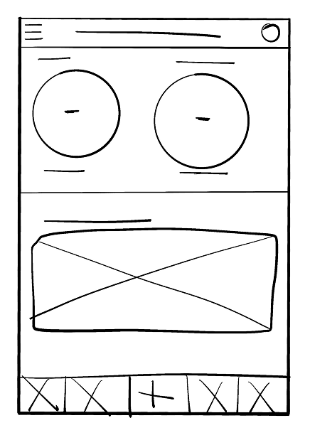
Paper Wireframes
Paper Wireframes
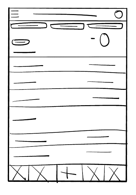
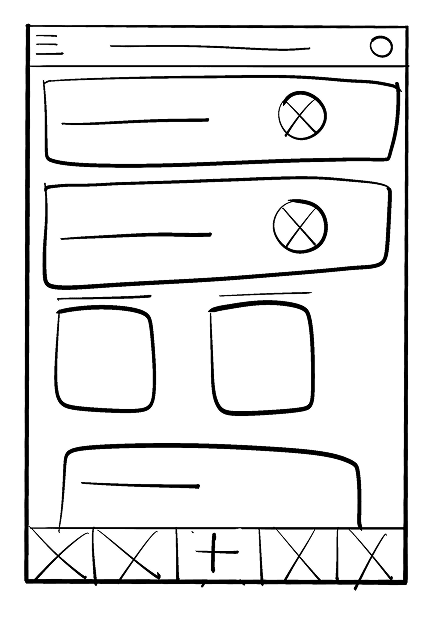
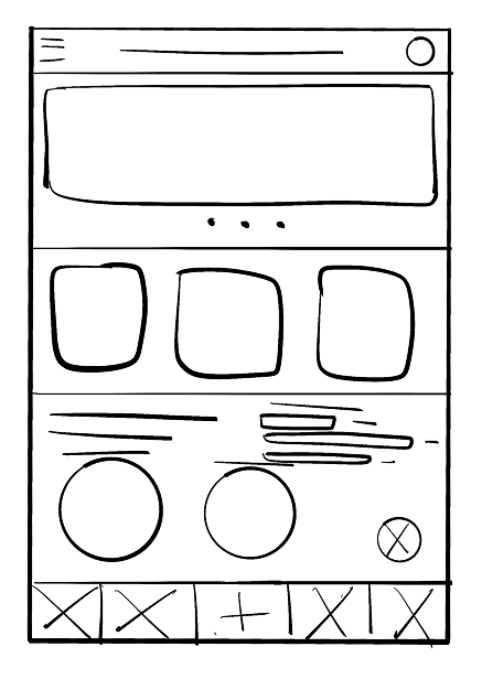
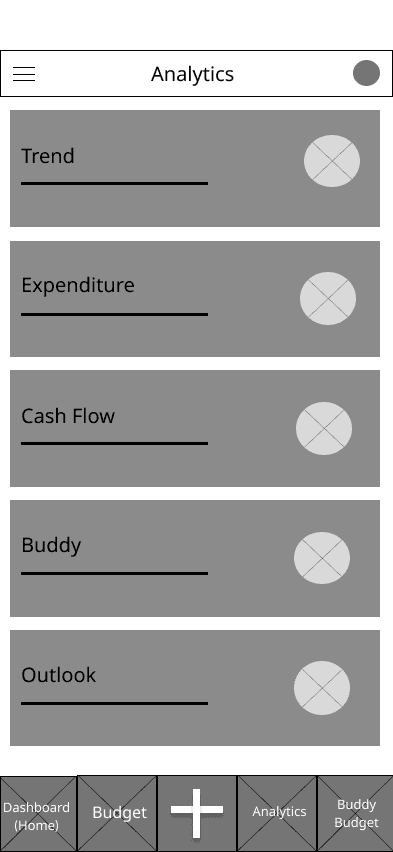
Low Fidelity Wireframes
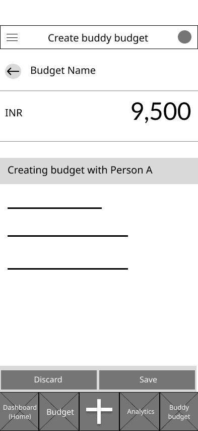
Creating Budget
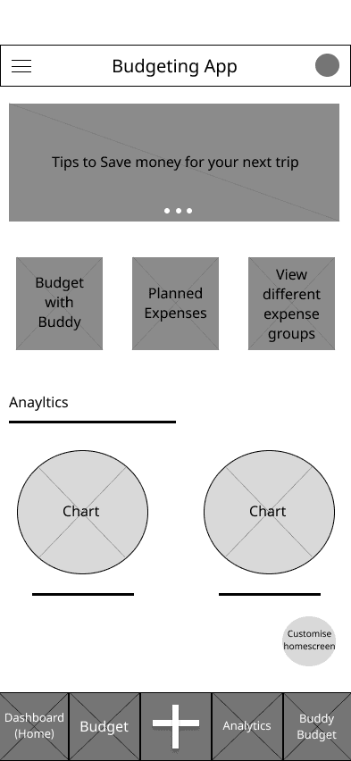
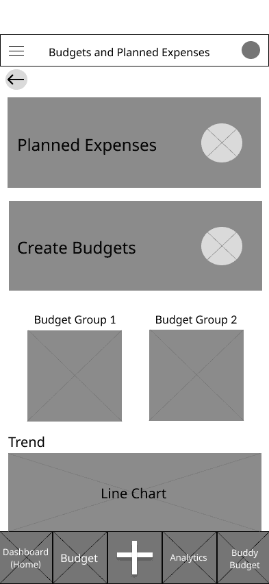

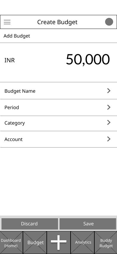
Budget with Buddy
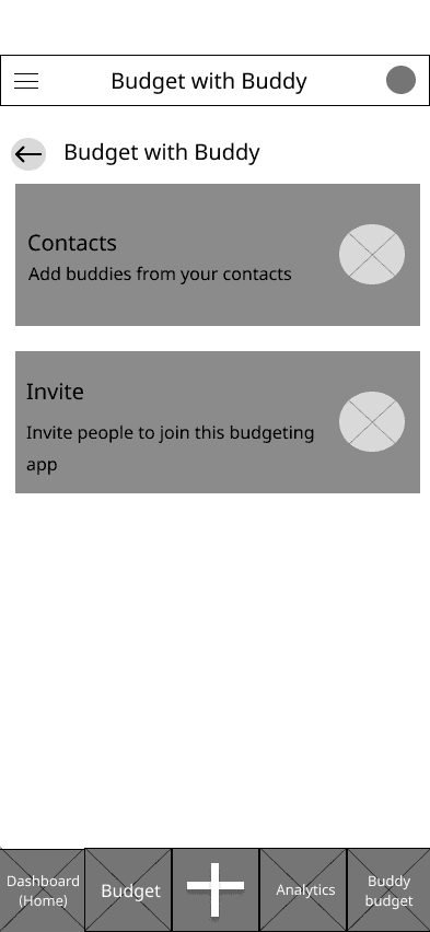
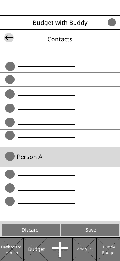
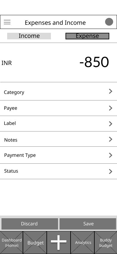
Expenses and Analytics
Low Fidelity Wireframes
Creating Budget
Budget with Buddy
Expenses and Analytics
Low Fidelity Wireframes
Creating Budget
Budget with Buddy
Expenses and Analytics
Low Fidelity Wireframes
Creating Budget
Budget with Buddy
Expenses and Analytics
2
Usability Study Findings
2
Usability Study Findings
2
Usability Study Findings
1
Users were confused about different keywords in different places.
2
Users were unsure of which button to click first to complete the ‘add budget’ task.
3
Users wanted a simpler design that was natural for them to navigate through.
3
Initial Generation using Bolt
3
Initial Generation using Bolt
3
Initial Iteration using Bolt
After the usability study, I crafted a detailed prompt and used Bolt.new to create a high-fidelity mockup, which I then refined further in Figma. The inclusion of dynamic interactions helped me visualise the main flow of the end product more effectively. Additionally, using Bolt enabled me to add more content rapidly, allowing for a quicker iteration process that aligns seamlessly with the user experience objectives.
After the usability study, I crafted a detailed prompt and used Bolt.new to create a high-fidelity mockup, which I then refined further in Figma. The inclusion of dynamic interactions helped me visualise the main flow of the end product more effectively. Additionally, using Bolt enabled me to add more content rapidly, allowing for a quicker iteration process that aligns seamlessly with the user experience objectives.

Revisions and Improvements
To address anomalies in my Bolt-optimised designs and prototypes, I leveraged prompt engineering and sometimes directly adjusting the code. Once I could visualise the changes and improvements, I refined the design in Figma.
To address anomalies in my Bolt-optimised designs and prototypes, I leveraged prompt engineering and sometimes directly adjusting the code. Once I could visualise the changes and improvements, I refined the design in Figma.
1
Originally, Bolt's category cards were too large, taking up excessive screen space. Addressing user demands for more customisation in tagging expenses, I redesigned the interface from bulky cards to a more efficient list format on a separate screen.
Bolt

Figma

Bolt

Figma

2
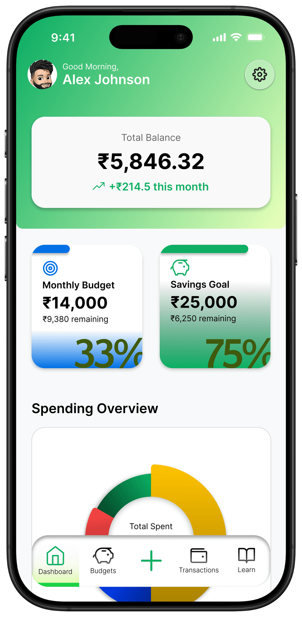
Bolt's website used a simple bar chart with six months of data to show spending trends. To improve flexibility and understanding, I replaced it with a line chart that shows trends and percentage changes for both the current and previous months. Users can also customize the timeframe to view data from different months.
3
Bolt used a simple list for spending categories, showing only amounts. I enhanced this by implementing a colour-coded donut chart that displays both amounts and percentages, making the data easier to read. I also enhanced the visual appeal of the budget cards by adding a gradient effect that fills the card with colour based on the percentage of the budget used by the user.
Bolt

Figma

Final Design
Bolt was instrumental in helping me visualise the designs and the main user flow more clearly, enabling faster iterations. Despite some anomalies, it made it easier to identify ineffective elements and uncover additional user pain points. I leveraged Bolt's initial framework to refine the designs, giving them a more polished and modern look while addressing user issues.
Bolt was instrumental in helping me visualise the designs and the main user flow more clearly, enabling faster iterations. Despite some anomalies, it made it easier to identify ineffective elements and uncover additional user pain points. I leveraged Bolt's initial framework to refine the designs, giving them a more polished and modern look while addressing user issues.
Since 'shared budget' is a key feature of my app, I prioritized creating the simplest user journey possible while ensuring full utilization of our features.
Since 'shared budget' is a key feature of my app, I prioritized creating the simplest user journey possible while ensuring full utilization of our features.

Hover to reveal the dark and light theme!


Interactive Prototpye
Shortcut: Use the bottom navigation bar to navigate to any page.
Take Aways
Take Aways
Take Aways
Hover to reveal!
Impact
Our target users shared that the design was intuitive to navigate through, more engaging with the images, and demonstrated a clear visual hierarchy.
Impact
Our target users shared that the design was intuitive to navigate through, more engaging with the images, and demonstrated a clear visual hierarchy.
Impact
What I Learned
What I Learned
I learned that even a small design change can have a huge impact on the user experience. The most important takeaway for me is to always focus on the real needs of the user when coming up with design ideas and solutions.
What I Learned
I learned that even a small design change can have a huge impact on the user experience. The most important takeaway for me is to always focus on the real needs of the user when coming up with design ideas and solutions.
Next Steps
Through follow-up usability testing on the new website, I gained valuable feedback. Our target users expressed that the design was intuitive, engaging with its visuals, and demonstrated a clear hierarchy that made navigation simple. This process taught me that even minor design changes could profoundly enhance the user experience. The key takeaway for me is the importance of continually focusing on the real needs of the users when developing design ideas and solutions. With more time, I would like to expand the SmartPocket product line by introducing additional features like tailored saving plans and advanced financial forecasting. With additional funding from these expansions, SmartPocket could evolve into a comprehensive hub for budget management and financial planning. Additionally, launching an online platform to offer personalized financial advice could extend its reach, helping more users to achieve financial stability and growth.