The Problem
Design Inconsistencies and Lack of Visual Hierarchy
The Solution
Transforming User Engagement
Recognising the app’s design shortcomings, my role grew as I led a major design overhaul to boost functionality and user engagement. I implemented a lean design system to ensure consistency, scalability, and cohesion across the app. Additionally, I introduced fundamental design principles to improve layout, interaction, and visual hierarchy, making the app more intuitive and reducing user frustration. I also expanded the user interface, designing over 40 screens to enhance detailed health tracking across various user flows, from setup to daily use and long-term trend analysis.

User Research: Identifying Pain Points
Understanding the limitations with the current app interface.
Initial Information Architecture structuring key modules like Dashboard, Analysis, Sessions, Experiments, Behavioral Tracking, and Profile, to optimize user flows and enhance navigational efficiency across the platform.

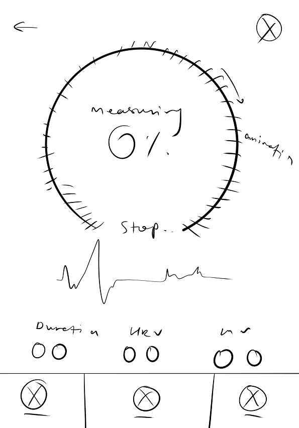
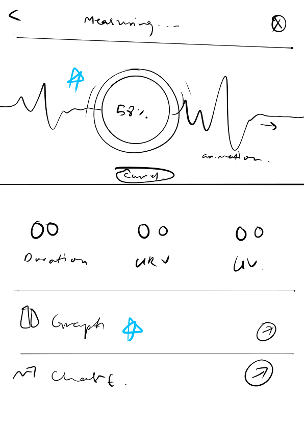
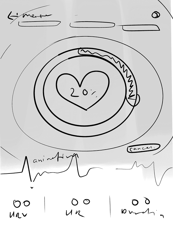


Animations and Mico-Interactions
1
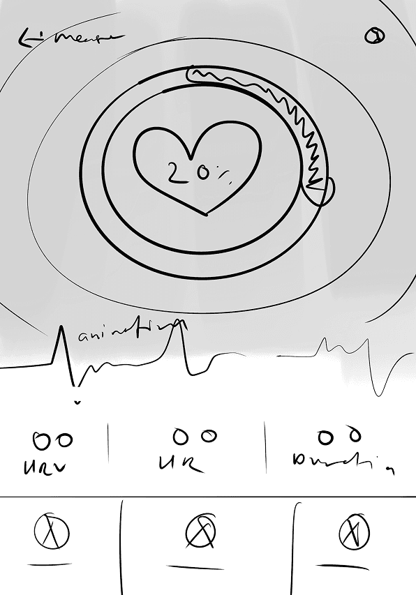
A colour-coded live feed display—green indicating calm and red indicating stress—complemented by dynamic tooltips that guide users to continue breathing or reduce stress based on their current state.
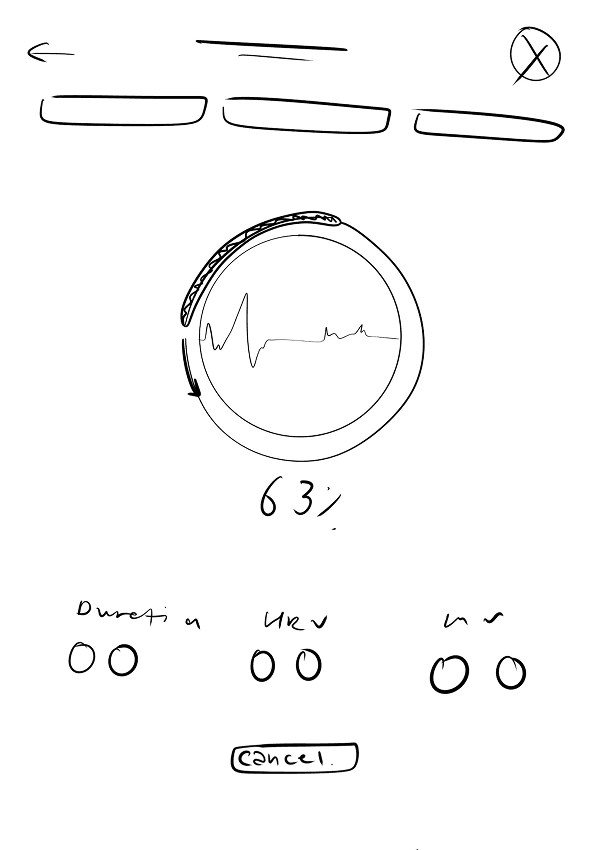
Before

After


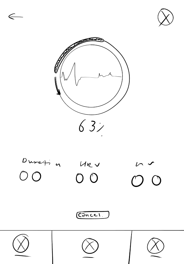
Before

After

2
Number of breathing cycles remaining displayed.
3
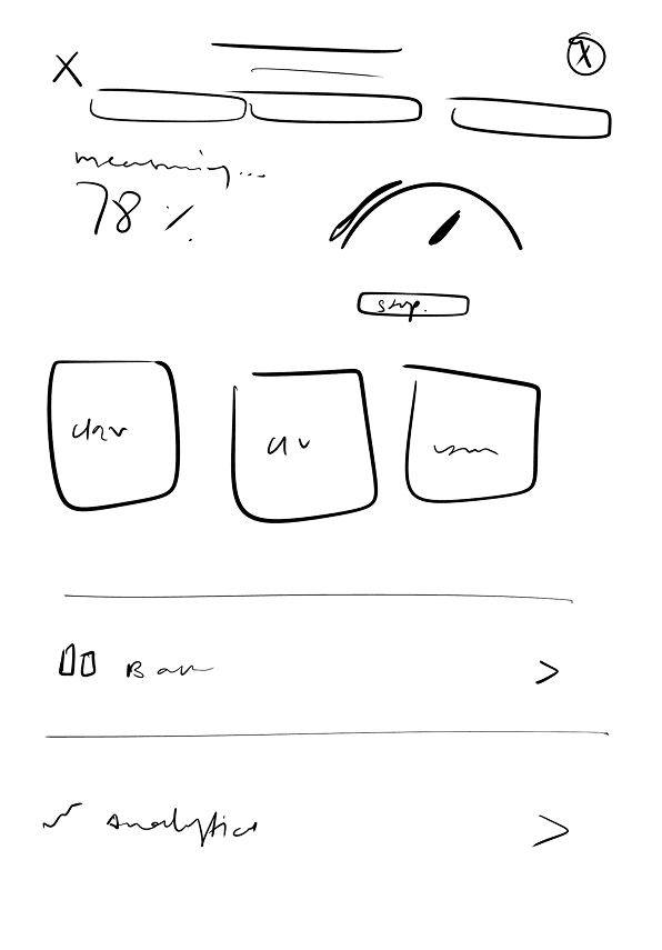
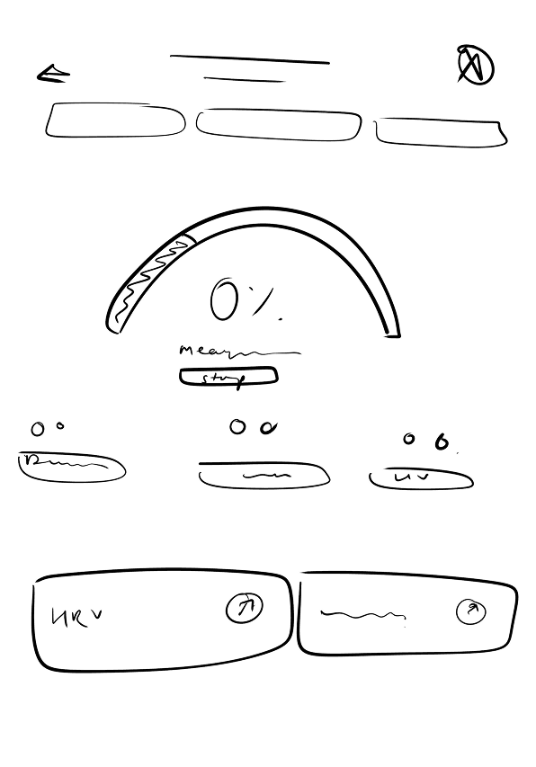
A more detailed view of past sessions with mean HR and HRV stats in each session along with time, date and duration of session.
Before

After

App Icon
I iterated on designs that creatively merged the elements of a heart and a brain, symbolising the harmonious balance between emotional health and mental clarity, while also incorporating additional vector elements that evoke peace, security, and tranquility.


Final App Icon

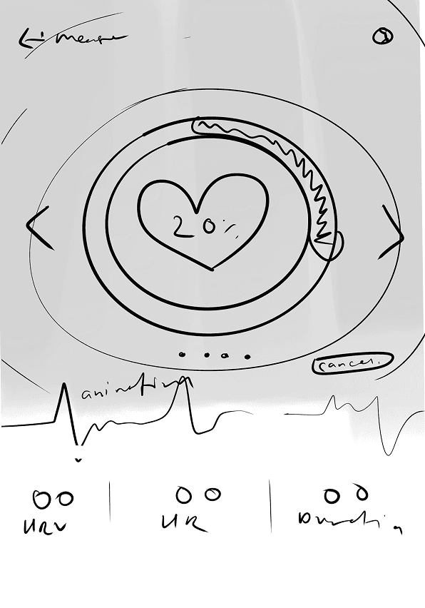
Real-time feedback
Post revisions: A real-time visual feedback system. Designed to instantly inform users about their current emotional state, encouraging immediate awareness and mindfulness. Promotes effective stress management by suggesting actionable steps in critical moments.
Custom Time Period and Detailed Analysis
This feature supports a greater depth of engagement by letting users explore their progress in detail. For the interactive calendar, I crafted a design that allows users to navigate smoothly through past entries and view detailed analysis of any session.
Next Steps
Now that the core UI design for the health tracking app is complete, the next phase focuses on continuously improving the user experience through strategic iteration and user-centered refinement. We'll conduct usability testing sessions with real users to observe how they interact with the app in real scenarios. Gathering qualitative and quantitative feedback will help us identify areas of friction, confusing interactions, or gaps that weren’t apparent during initial design. As the app grows, refining the onboarding flow will be essential. Clearer tutorials, contextual tooltips, and personalized introductions can help new users feel confident navigating the app and understanding key features. Future updates may include customization options based on user goals, such as tailoring insights, reminders, and dashboard components to reflect individual health objectives.